How to add popover to awesome font?
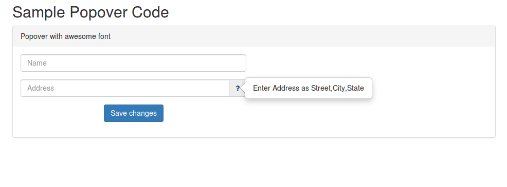
If you like to display a popover as shown in the above image,
You should include following files in your html head.
    <head>
        <script src="js/jquery.min.js"></script>
        <script src="js/bootstrap.min.js"></script>
        <link rel="stylesheet" href="css/font-awesome.min.css">
        <link rel="stylesheet" href="css/bootstrap.min.css">

    </head>
Below is the html body content. The popover should come when placing mouse over the awesome font with class name “fa fa-question”. The awesome font is written as an inner html of a tag. Two important attributes we added to the tag are 1)data-toggle=”popover” and 2)data-content=”[popover message]”.
<body>
<div class="container">
    <h2>Sample Popover Code</h2>
    <div class="panel-group">
        <div class="panel panel-default">
            <div class="panel-heading">Popover with awesome font</div>
            <div class="panel-body">
                <div class="row form-group">

                    <div class="col-sm-6">
                        <input class="form-control" type="text"
                               placeholder="Name"  name="name" />
                    </div>

                </div>

                <div class="row form-group text-center">

                    <div class="col-sm-6">
                        <div class="input-group">
                            <input placeholder="Address"
                                   class="form-control pooja-star"
                                   type="text" name="address"/>
                            <span class="input-group-addon">
                                <a
                                    data-toggle="popover"
                                    data-content="Enter Address as
                                    Street,City,State">
                                    <i class="fa fa-question"></i>
                                </a>
                            </span>
                        </div>
                    </div>

                </div>
                <div class="row form-group text-center">
                    <div class="col-sm-6">
                <button type="submit" class="btn btn-primary">
                Save changes
            </button>
                </div></div>
            </div>
        </div>

    </div>
</div>
</body>
Below javascript code is required, where we set when the popover should be displayed, and also we are defining the selector.
As we set selector: ‘[data-toggle=”popover”]’ and
trigger: ‘hover’, when we place mouse over an element with attribute data-toggle=”popover” the popover function will be called.
<script type="text/javascript">
    var popOverSettings = {
        trigger: 'hover',
        container: 'body',
        html: true,
        selector: '[data-toggle="popover"]',

    }

    $('body').popover(popOverSettings);
</script>
You can customize the look of awesome font and the background box
by adding your style to the below classes.
.input-group-addon {
    background-color: #your-color-here;
    border:0px
}

.fa-question {
    //style here
}